This chart was done in 1920 by a Dartmouth biologist named William Patten. Gould included this and many other excellent graphics to help convey understanding of how we came to be human. 
  

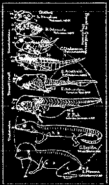
It has since been proven that the creature pictured fifth from the top does not really belong in that spot evolutionarily, but the concept is what i'd like to see done using new tools. 


the point 

ideas 
   a very brief history of time    
   waves of generations    
   a model of many-to-many    

activities  
   dAg  
   The Bios Group  
   Mindsphere  

so what 
   consulting services    
   contact info  
   go here next